Brunei’s first dedicated refill store for low impact living.
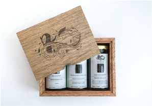
Kaimana came to us to develop a logo and packaging that reflects their commitment to being a responsible business that focuses on environmental impact.
‘Kaimana’ means ‘The Power of the Sea’
So a wave of scroll work is interlaced with the letter ‘K’ forming a subtle infinity symbol. It expresses raw dynamic energy and conviction in the strength of the ‘green wave,’ or eco-friendly movement.
Submark
Main Colors
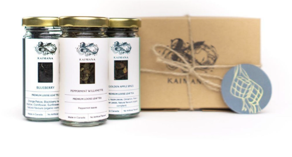
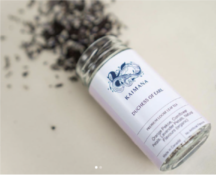
For Kaimana’s tea labels, we created a custom illustration of tea leaves and used color to differentiate between black tea, green tea and herbal tea. Originally we had windows in these labels but eventually removed the window to make the process more eco-friendly and use less label glue.
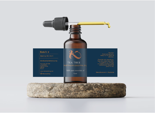
The body care label design was minimal, to look like an every day basic use item, while the essential oil label was made to have a more premium feel with the dark blue and copper color palette.